I've recently written a paper for CMG06 called "Utilization is Virtually Useless as a Metric!". Regular readers of this blog will recognize much of the content in that paper. The follow-on question is what to use instead? The answer I have is to plot response time vs. throughput, and I've been thinking about a very specific way to display this kind of plot. Since I'm feeling quite opinionated about this I'm going to call it a "Cockcroft Headroom Plot" and I'm going to try and construct it using various tools. I will blog my way through the development of this, and I welcome advice and comments along the way.
The starting point is a dataset to work with, and I found an old iostat log file that recorded a fairly busy disk at 15 minute intervals over a few days. This gives me 250 data points, which I fed into the
R stats package to look at. I'll also have a go at making a spreadsheet version.
The iostat data file starts like this:
                    extended device statistics
 r/s  w/s   kr/s   kw/s wait actv wsvc_t asvc_t  %w  %b device
14.8 78.4  183.0 2446.3  1.7  0.6   18.6    6.6   1  21 c1t5d0
 0.0  0.0    0.0    0.0  0.0  0.0    0.0    5.0   0   0 c0t6d0
...
I want the second line as a header, so save it (my command line is actually on OSX, but could be Solaris, Linux or Cygwin on Windows)
% head -2 iostat.txt | tail -1 > headerI want the
c1t5d0 disk, but don't want the first line, since its the average since boot, and want to add back the header
% grep c1t5d0 iostat.txt | tail +2 > tailer
% cat header tailer > c1t5.txt
Now I can import into R as a space delimited file with a header line. R doesn't allow "/" or "%" in names, so it rewrites the header to use dots instead. R is a script based tool with a command line and a very powerful vector/object based syntax. A "data frame" is a table of data object like a sheet in a spreadsheet, it has names for the rows and columns, and can be indexed.
> c1t5 <- read.delim("c1t5.txt",header=T,sep="")> names(c1t5) [1] "r.s" "w.s" "kr.s" "kw.s" "wait" "actv" "wsvc_t" "asvc_t" "X.w" "X.b" "device"I only want to work with the first 250 data points so I subset the data frame by indexing the rows with an array (
1:250) that selects the rows I want and leaving the column selector blank.
> io250 <- c1t5[1:250,]The first thing to do is summarize the data, the output is too wide for the blog so I'll do it in chunks by selecting columns.
> summary(io250[,1:4])
      r.s              w.s             kr.s             kw.s
 Min.   :  1.80   Min.   :  1.8   Min.   :  13.5   Min.   :   38.5
 1st Qu.: 10.30   1st Qu.: 87.1   1st Qu.: 107.4   1st Qu.: 2191.7
 Median : 18.90   Median :172.4   Median : 182.8   Median : 4279.4
 Mean   : 22.85   Mean   :187.5   Mean   : 290.1   Mean   : 4448.5
 3rd Qu.: 28.88   3rd Qu.:274.6   3rd Qu.: 287.4   3rd Qu.: 6746.6
 Max.   :130.90   Max.   :508.8   Max.   :4232.3   Max.   :13713.1
> summary(io250[,5:8])
      wait             actv            wsvc_t           asvc_t
 Min.   : 0.000   Min.   :0.0000   Min.   : 0.000   Min.   : 1.000
 1st Qu.: 0.000   1st Qu.:0.3250   1st Qu.: 0.400   1st Qu.: 3.125
 Median : 0.600   Median :0.8000   Median : 2.550   Median : 4.700
 Mean   : 1.048   Mean   :0.9604   Mean   : 5.152   Mean   : 4.634
 3rd Qu.: 1.300   3rd Qu.:1.5000   3rd Qu.: 6.350   3rd Qu.: 5.700
 Max.   :10.600   Max.   :3.5000   Max.   :88.900   Max.   :15.100
> summary(io250[,9:10])
      X.w             X.b
 Min.   :0.000   Min.   : 2.00
 1st Qu.:0.000   1st Qu.:20.00
 Median :1.000   Median :39.50
 Mean   :1.428   Mean   :37.89
 3rd Qu.:2.000   3rd Qu.:55.00
 Max.   :9.000   Max.   :92.00
Looks like a nice busy disk, so lets plot everything against everything (pch=20 sets a solid dot plotting character)
> plot(io250[,1:10],pch=20)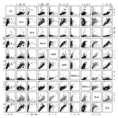
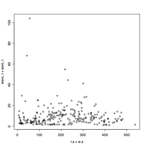
The throughput is either reads+writes or KB read+KB written, the response time is wsvc_t+asvc_t since iostat records time taken waiting to send to a disk as well as time spent actively waiting for a disk.
To save typing, I attach to the data frame so that the names are recognized directly.
> attach(io250)> plot(r.s+w.s, wsvc_t+asvc_t)
This looks a bit scattered, because there is a mixture of average I/O sizes that varies during the time period. Lets look at throughput in KB/s instead.
> plot(kr.s+kw.s,wsvc_t+asvc_t)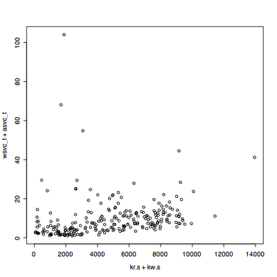
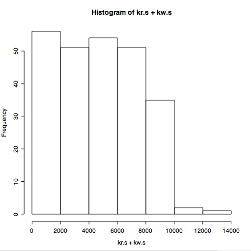
That looks promising, but its not clear what the distribution of throughput is over the range. We can look at this using a histogram.
> hist(kr.s+kw.s)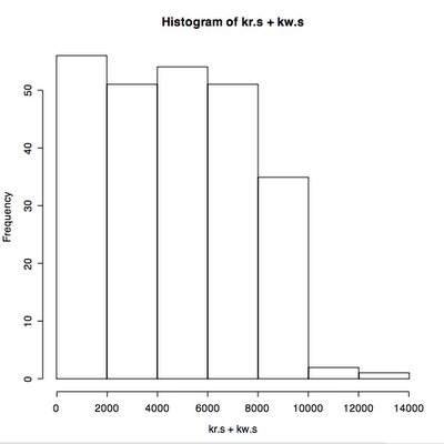
We can also look at the distribution of response times.
> hist(wsvc_t+asvc_t)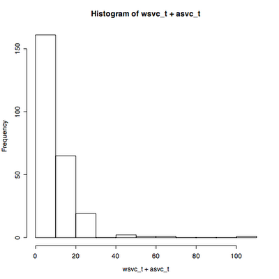
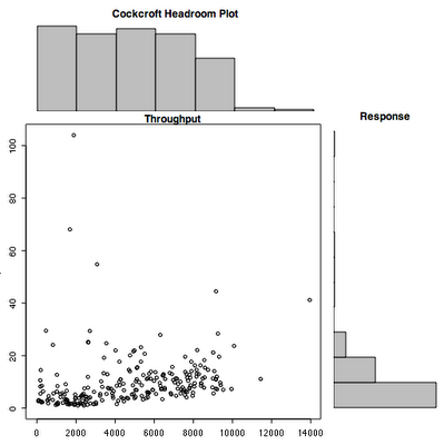
The starting point for the thing that I want to call a "Cockcroft Headroom Plot" is all three of these plots superimposed on each other. This means rotating the response time plot 90 degrees so that its axis lines up with the main plot. After looking around in the manual pages I eventually found an example that I could use as the basis for my plot. It needs some more cosmetic work but I defined a new function
chp(throughput, response) shown below.
> chp <- function(x,y,xl="Throughput",yl="Response",ml="Cockcroft Headroom Plot") {
   xhist <- hist(x,plot=FALSE)
   yhist <- hist(y, plot=FALSE)
   xrange <- c(0,max(x))
   yrange <- c(0,max(y))
   nf <- layout(matrix(c(2,0,1,3),2,2,byrow=TRUE), c(3,1), c(1,3), TRUE)
   layout.show(nf)
   par(mar=c(3,3,1.5,1.5))
   plot(x, y, xlim=xrange, ylim=yrange, main=xl)   par(mar=c(0,3,3,1))
   barplot(xhist$counts, axes=FALSE, ylim=c(0, max(xhist$counts)), space=0, main=ml)
   par(mar=c(3,0,1,1))
   barplot(yhist$counts, axes=FALSE, xlim=c(0, max(yhist$counts)), space=0, main=yl, horiz=TRUE)
}
The result of running
chp(kr.s+kw.s,wsvc_t+asvc_t)is close...
That's enough to get started.